Creating a friendlier shopping experience for new users —
Revamping the mobile shopping experience.
Background
Wish, a free e-commerce app, serves as a mobile mall that connects shoppers to manufacturers for maximum product affordability. As part of my application for their 2020 Product Design Intern position, I completed this design challenge. Due to time constraints, I chose to focus on new user retention.
Role
Product Designer
Team
Me!
Duration
1 week, Oct. 2020
Tools
Figma
Design Challenge
“Dive deeply into one problem you find in the Wish mobile app and design a solution. How can your solution be an impact on user acquisition, retention, engagement, sales, or other attributes?”
The Problem
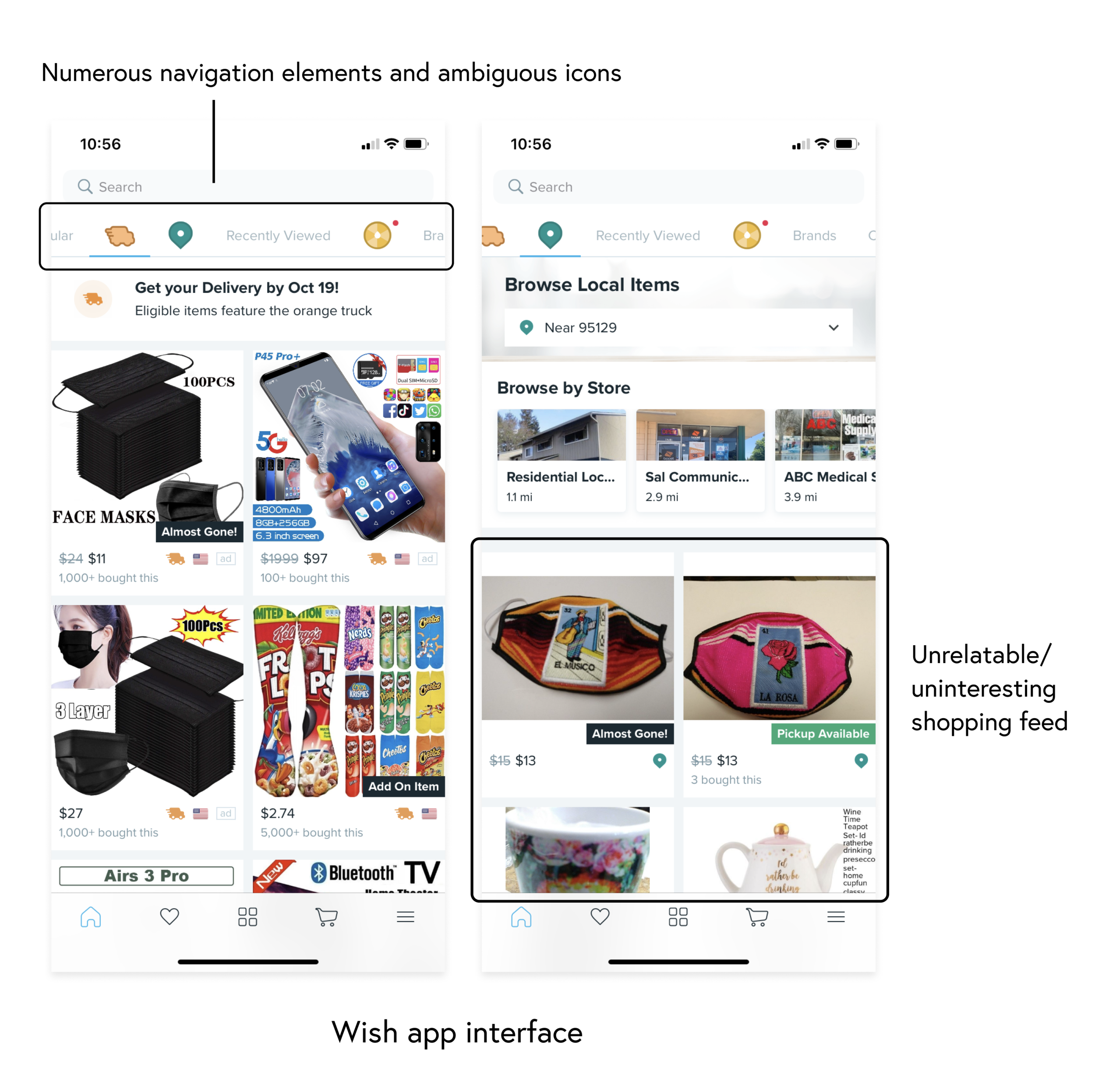
Confusing navigation and unrelatable shopping feeds prevent new users from coming back to the app.
I conducted 5 user tests to understand the problem space. From these user tests, I noted two major themes: users weren’t interested in the product listings on their feed, and the browsing experience was overwhelming and confusing.
Solution Scope
Increase user retention and engagement by revamping the app’s information architecture to enhance new users’ shopping experience.
Design Process
I followed the below design process:

Understanding the Context
My initial research involved understanding the scope. I sought to understand Wish’s business goals, target audience, and design beliefs. Due to the limited timeline, I focused on addressing one of their guiding design beliefs:

User Interviews
I conducted interviews and user tests with 5 peers. I noted that:
New users struggle to find content that engages or interests them
The numerous menu options confuse users
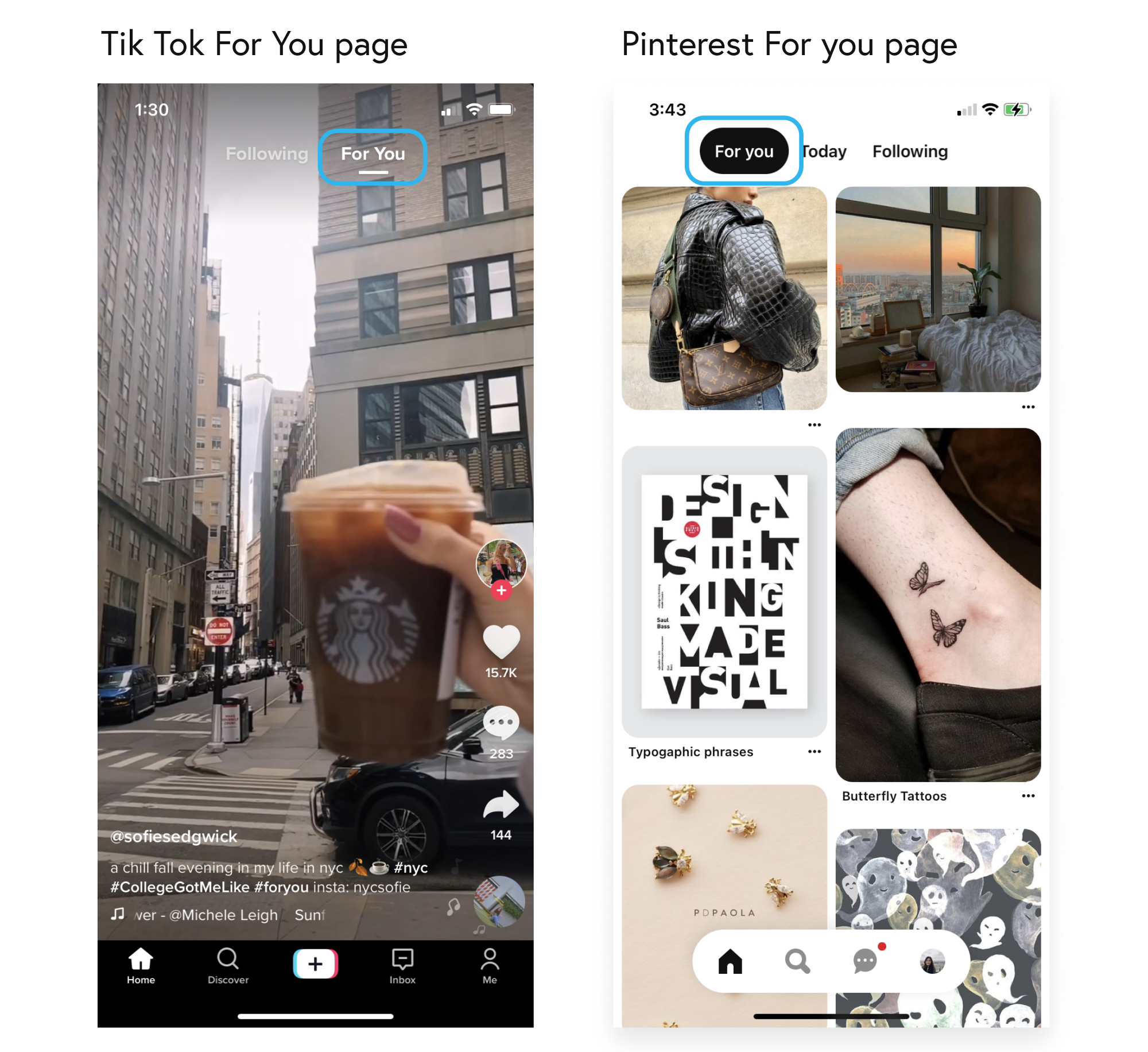
Users are familiar with and enjoy using apps such as Tik Tok, Instagram and eBay
Market Research
To help with the ideation process, I conducted some market research on indirect and direct competitors:
Direct competitors, such as AliExpress and eBay, include a home page that organizes content into distinct sections.

Popular media-heavy apps, such as Pinterest and Tik Tok, feature a “For You” page related to users’ interests.
To learn more about my process, please view my process deck:
The Solution
A simplified navigation bar that separates the shopping experience into three top-level destinations: Featured, For You, and Get It Fast.
My redesign separates the shopping experience into three top-level destinations: the Featured page allows users to browse items by category, such as popular or seasonal items; the For You page presents users with an infinite selection of items tailored to their interests; and the Get It Fast page allows users to find items that can be promptly delivered or picked up.

Takeaways
Throughout this process, I came to understand the significance of a good navigation system, especially in a mobile shopping context. Navigation systems present users with a structure for utilizing an app and can greatly improve or take away from their overall experience; my initial interviews and tests with Wish users served as a good example of this!
Next Steps
As for next steps, I’d like to take a closer look at Wish’s mobile information architecture (IA). Although initially I avoided doing so due to time constraints, redesigning the IA first would have served as a great foundation for my navigation redesign. I’d also like to conduct user testing to understand if my redesign truly had the impact I hoped for and consider all feedback in future iterations.