Designing for the intersection of diet and climate change —
Helping food-conscious consumers reduce their consumption of production-heavy foods.
Background
Today’s food supply chain contributes to roughly 26% of man-made greenhouse gas emissions. Red meat and dairy products, two staples in many households, are two of the most production-heavy foods!
To encourage people to reduce their consumption of these foods, I introduced a new climate-related feature for MyFitnessPal.
Role
Product Designer
Team
Me!
Duration
Sept. - Oct. 2020
Tools
Figma, Miro
Design Challenge
How might we motivate users to consume more climate-friendly foods?
The Solution
A new climate impact feature on MyFitnessPal that:
1) improves users’ understanding of how food impacts the environment, and
2) provides suggestions for similarly nutritious and flavorful alternatives.

Why Myfitnesspal?
Introducing climate-related content to MyFitnessPal can empower diet-conscious consumers to make more climate-friendly decisions around food.
I noted that apps directly related to the climate, such EcoCRED and Earth Hero, maintain a small user base. Moreover, these apps are not food-oriented. I inferred that these apps are mainly utilized by users who are already invested in reducing their carbon footprint.
On the other hand, calorie counter apps target millions of users that are reflecting on their food choices on a daily basis. MyFitnessPal in particular boasts 19+ million users and is ranked #5 in Health & Fitness on the App Store (iOS).
Survey Findings
To define the solution scope and strategy, I conducted two surveys.
The first survey was focused on understanding user’s habits and thoughts in relation to the MyFitnessPal app. For example, which features did users use most often?
Or, which menu options did they use most often? Did they have any thoughts about the overall design of the app? I learned some interesting insights from 12 survey responses:

My focus for the second survey was to understand users’ thoughts and behaviors in relation to food and the climate. I asked users about their knowledge of food’s impact on climate change, as well as their thoughts on lower-impact food alternatives. I organized common themes from the 17 survey responses into an affinity diagram.
Survey Insights & Market Research
When designing the flow, I considered the concerns and motivations stated in the second survey’s results. Two concerns in particular drew my attention, and I brainstormed how to account for them in my design:
“I know animal products aren’t great for the climate, but which ones are the worst?”
↪ How might I incorporate a ranking system for the varying climate impact levels of different foods?
After trying out several food-related apps and taking note of how they designed various features, I drew inspiration from the Food Ratings feature on Lifesum, another highly-rated food tracking app.

“I follow a strict diet with specific macronutrients – protein is important to me.”
↪ How might I help users find food alternatives that also satisfy their diet needs or preferences?
Because I was designing within MyFitnessPal, I needed to consider its current interface + interaction design. I followed the layout for their “Foods Highest In [Macronutrient]” feature when wireframing and took note of how different interactions occurred.
User Flows
After sketching out various user flows, I finalized this user flow for the climate feature. This flow introduces several new screens to the app, including the climate impact page, climate impact lists, and food alternatives lists.
Wireframes
I sketched several paper and pencil wireframes to guide my design. After finalizing the paper wireframes, I moved them to Figma.

Final Design
Learning about the Climate Impact feature
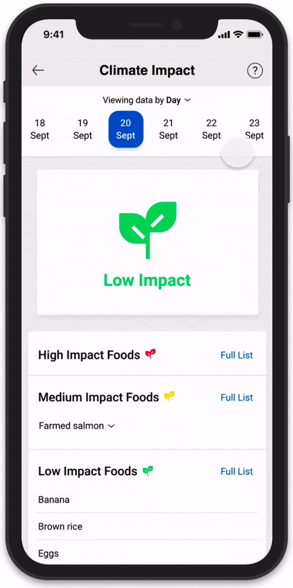
The Climate Impact page shows users’ logged food in order of High Impact to Low Impact. Users can click on “Full List” to see what specific foods are considered High/Medium/Low Impact.
New users can click on the question mark icon to learn about what different icons mean and how the Climate Impact feature is designed.


Viewing additional resources around food and its climate impact
Users can click on specific foods within the Impacts section, such as “Farmed salmon”, to view lower impact alternatives. Alternatively, users can browse topics in the expanded section to find relevant resources within the MyFitnessPal app. These resources also serve to increase users’ engagement with the MyFitnessPal app.
Takeaways
This project challenged me to consider how I might incorporate a new informative feature within an already content-heavy app. MyFitnessPal utilizes few colors and is text-oriented yet simple, and the main features users utilize, such as the Food Diary and Nutrition Facts, are text-sparse. To design a solution that integrated into the app as seamlessly as possible, I identified common design patterns used in popular apps and iterated many, many times. 🌱
Next Steps
To solidify my design decisions, I would test my feature on current users to identify any elements and interactions that could be improved. For this feature to be as impactful as possible, the MyFitnessPal app would need to incorporate climate-related content into its other features, such as the Recipes and Community pages. Thus, I would also focus on adding relevant climate-related content within the MyFitnessPal app to make the Climate Impact feature more meaningful for users.