Eagle 1 CPR —
A new site experience to promote customer interaction and improve customer understanding.
Background
Eagle 1 CPR is a San Diego-based, veteran-owned provider of First Aid and CPR certification courses. I worked with Eagle 1 CPR’s founder to identify pain points with their current site and design a new site that resolved those issues.
my role
Interaction Design
Brand Design
Team
Alex Yuen
Leah Ahn
Chris Wong
Tools
Figma
Design Process

THE PROBLEM
Outdated site design leads users to distrust the company.
Outdated icons, images and text styles discourage people from interacting with the site. Users quickly perceive the company as less professional and trustworthy than its competitors.

Confusing site navigation and functionality causes customer frustration.
Clicking on links under “Heart Association Certifications” leads to the Course Schedule page, rather than unique pages with detailed information on specific courses. This causes frustration and confusion for users hoping to learn more about a specific course.

DESIGN OPPORTUNITY
Through a redesign of the entire Eagle 1 CPR site, we can encourage people to interact with its online services and help them understand its unique value.
The Solution
To resolve the primary pain points, our redesign included three new features:
A strong focus on the company’s high ratings and credentials on the Home page.
One business priority for the site redesign was highlighting Eagle 1 CPR’s high ratings and professionalism.
To do so, we included customer testimonials and company credentials on the Home page - the first screen they see. We also featured some of the company’s largest past customers, such as San Diego State University and the San Diego Padres.

A simplified online course registration flow with interactive dropdown descriptions.
A key focus in our redesign was promoting user interaction and understanding.
To clarify the course selection and registration process, I redesigned the Courses page with dropdown explanations and registration buttons, as well as new course registration forms.
An engaging layout for the About page with more images and condensed text descriptions.
The previous About page was extremely text-heavy.
To make it more approachable, we organized information about the company’s objectives into interactive boxes. We also condensed several descriptions about Eagle 1 CPR and included images of its team to make the company more personable.
THE PROCESS: CONDUCTING RESEARCH, USER TESTS & ITERATIONS
What did we learn from our interviews, user tests and competitive analyses?
INTERVIEWING THE CLIENT: Discussing Business Needs
My team and I met with Eagle 1 CPR’s CEO, Randy Sarmiento, and established a list of business priorities for the website during our first meeting. The CEO wanted the redesign to emphasize its veteran-owned aspect and quality teaching – “…crucial to highlight our premium teaching and premium services. Being veteran-owned is also a unique factor to emphasize.”
We established six business-related goals to guide our process:

INTERVIEWING USERS AND CREATING PERSONAS
We conducted 9 interviews with past and potential customers and compiled our findings into 3 personas with different goals, needs and frustrations. These personas helped us determine which site interactions and flows were most significant. Some background questions we asked were:
Have you been in a medical emergency before?
Have you taken CPR/First Aid courses before? What was that experience like?
What is your impression of Eagle 1 CPR after browsing through its website?
APPLYING PERSONAS TO USE CASES
We came up with 20 scenarios, or use cases, customers might find themselves in. This helped us determine which functions and interactions should be prioritized.
The use cases that applied to all three personas were prioritized: learning about the company’s background, viewing the course schedule, and registering online.
INFORMATION ARCHITECTURE (IA)
Having discussed the potential use cases, I reorganized the website’s IA by use case priority. I also considered our client’s business goals – for example, I included Past Clients and Testimonials under the Home page to highlight the high customer reviews and quality instruction.

User Testing With Wireframes
After sketching and ideating, we moved on to designing high fidelity wireframes. Drawing on the 20 use cases, we tested these wireframes on potential users. I asked three users to complete three tasks:
Find a course that aligns with your schedule
Register for a course
Contact Eagle 1 CPR

Some of the critiques we received centered around the site’s visual design and text layout.
For example, some users weren’t motivated to read through the site’s text. Other users, such as Derek, thought it stood out poorly amongst competitor sites, such as A-B-CPR, CPR Training Professionals, and Express Training Solutions.
Derek commented on the similarity between their color schemes, observing that “…the red and white tone make Eagle 1 CPR seem like any other CPR company.”
Moving forward, we utilized a new style guide.
I rebranded and restyled the entire site using gray and yellow tones, similar to that of the U.S. Army, to highlight the company’s veteran-owned aspect and distinguish it from competitor sites.
Final Design
*Due to time constraints, we weren’t able to address all details before the submission deadline. Upon submission, I touched up the interactions under “Our Mission” and several other UI elements for clarity and simplicity purposes.

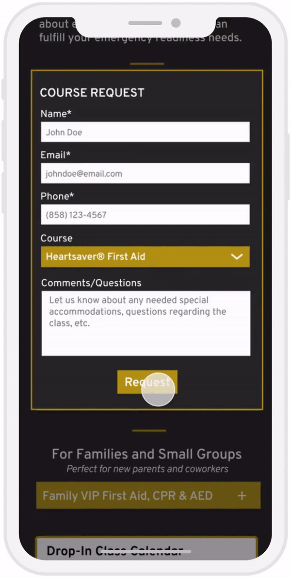
Registering for a course
I was solely responsible for designing this page! Users can click on each course, such as “HEARTSAVER® CPR & AED,” to view a dropdown description of what the course provides training on, as well as its cost and time.
Users can also register for courses immediately after by clicking on the “Register” button at the bottom of each dropdown.

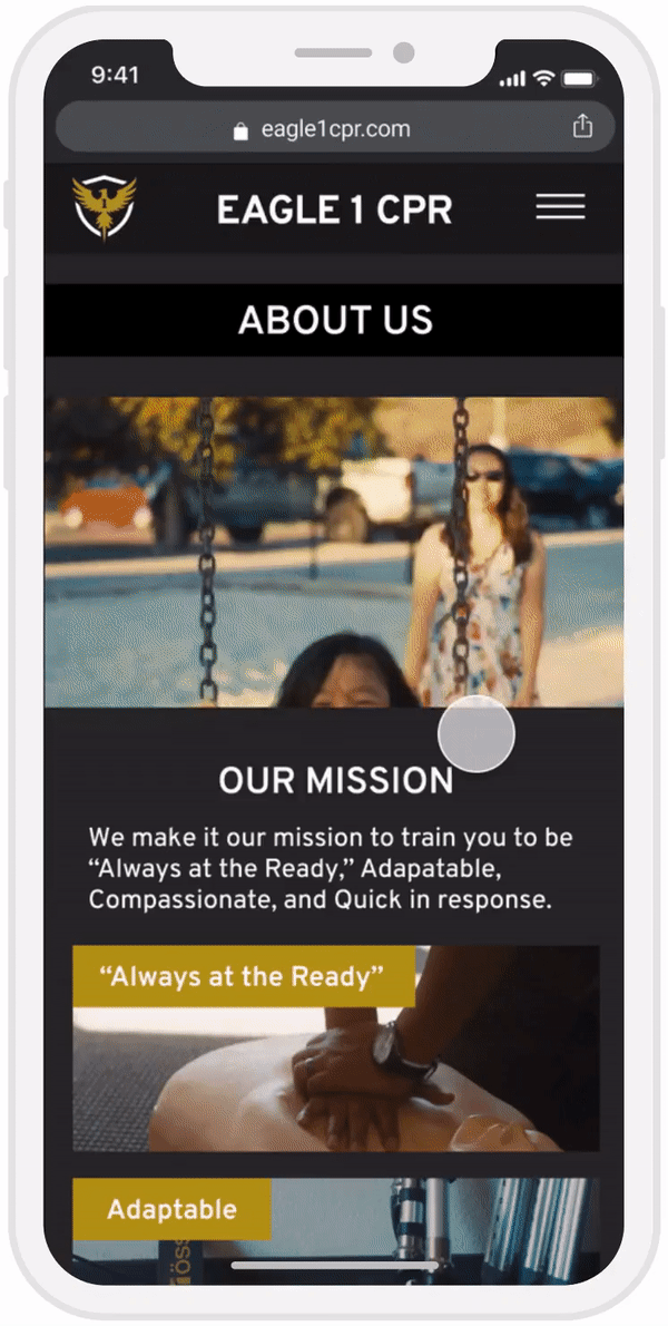
Learning about the company
The new About page provides summarized descriptions of the company’s mission, vision, and CEO. Users can click on each image under “OUR MISSION ” to learn more about what each mission statement means.
*I touched up the interactions here.

Takeaways
Working with a real client required me to learn how to better communicate my design rationale. Some of the user testing insights we gained directly contrasted what the client wanted on his site – for example, although many users disliked the Google Calendar extension, our client prioritized having this functionality on his site.
It was crucial that we addressed these differences with the client to reach a compromise on a design that would both help users and achieve the client’s goals. 💡
Next Steps
If provided more time, I would test this prototype on users to identify any missed pain points or new frustrations. I would also consider redesigning the visual layout of various pages to allow for more white space. A member of our team is currently working with the founder to implement our design!
*Put on hold due to COVID-19*